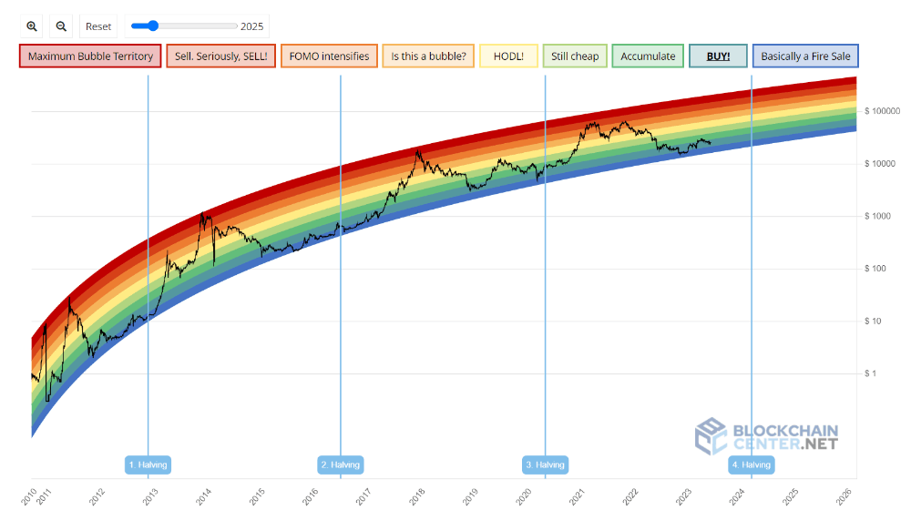
The Bitcoin Rainbow Chart: Decoding the Colors of Crypto
Bitcoin has captivated the world with its revolutionary potential. As the popularity of Bitcoin soared, so did the emergence of tools and indicators aimed at understanding its price patterns.
One such tool that gained significant attention is the Bitcoin Rainbow Chart. In this article, we'll delve into the concept of the Bitcoin Rainbow Chart, shedding light on its origins and how it can assist in analyzing Bitcoin's price movements.
The Genesis of the Bitcoin Rainbow Chart:
The Bitcoin Rainbow Chart, which has gained recognition for its visual appeal and insightful analysis, was originally created by a Reddit user named Azop. While the pseudonymous analyst Hermes contributed to the creation of a similar chart, the credit for the Bitcoin Rainbow Chart's genesis goes to Azop. Their work took shape on the Reddit platform, where they shared their observations and findings with the crypto community.
Understanding the Basics:
At its core, the Bitcoin Rainbow Chart is a graphical representation of Bitcoin's historical price data. It leverages a logarithmic scale to portray Bitcoin's price levels over time. The chart's distinctive feature lies in its use of colors, which enable users to quickly identify different price ranges and assess Bitcoin's value relative to its historical performance.
Unveiling the Colors:
The Bitcoin Rainbow Chart employs a vivid spectrum of colors to represent various price ranges. It starts with cooler shades of blue, indicating lower price levels, and gradually transitions to warmer tones of green, yellow, orange, and ultimately red, symbolizing higher price levels. These color-coded sections divide Bitcoin's price history into distinct zones, offering valuable insights for traders and investors.
Interpreting the Chart:
While the Bitcoin Rainbow Chart is a remarkable tool, it is essential to remember that past price movements do not guarantee future outcomes. Nevertheless, the chart serves as a valuable resource to comprehend Bitcoin's market cycles and general price trends. By identifying the different zones on the chart, traders can gain a sense of whether Bitcoin is relatively undervalued or overvalued compared to historical data.
Deciphering the Buying and Selling Zones:
The Bitcoin Rainbow Chart often highlights two crucial zones for traders: the "buy zone" and the "sell zone." The buy zone, encompassing the lower blue and green colors, suggests potential buying opportunities when Bitcoin's price is relatively low. Conversely, the sell zone, represented by the higher orange and red colors, indicates potential selling opportunities when Bitcoin's price is relatively high.
Navigating the Cycles:
Through careful examination of the Bitcoin Rainbow Chart, users can uncover recurring patterns and cycles that Bitcoin has historically followed. These cycles may indicate optimal times to accumulate Bitcoin during price dips and consider selling during price peaks. However, given the highly volatile nature of the cryptocurrency market, it is important to exercise caution and consider additional factors when making investment decisions.
Limitations and Prudent Decision-Making:
While the Bitcoin Rainbow Chart is a valuable tool, it does have limitations. External factors such as regulatory changes, market sentiment, and significant events can influence Bitcoin's price and may not be reflected in the chart alone. Therefore, it is wise to supplement insights from the chart with other forms of analysis, such as fundamental and technical analysis, to make well-informed investment decisions.
The Rainbow Chart V2
The original Bitcoin Rainbow Chart is dead! The chart, which was based on a model developed in 2014, held for quite some time. But after a brutal 2022 in the crypto industry it was just no longer valid.
The Rainbow Chart V2 is a new version of the Bitcoin Rainbow Chart, which is a visual representation of the potential price trajectory of Bitcoin. The new version is based on a completely new formula that has been fitted with data until 2022 and explains every move of the Bitcoin price so far.
The chart allows users to zoom and pan, as well as add more years to the rainbow. The legend labels and colors have remained the same, but the potential trajectory for the Bitcoin price is not as bullish as the old one. The chart is created by fitting two curves, one for the highs and one for the lows, and interpolating the rest to create a beautiful rainbow.
Conclusion:
By analyzing the color zones and cycles on the chart, traders and enthusiasts gain valuable insights into potential buying and selling opportunities. However, it is crucial to approach the chart as part of a comprehensive analysis toolkit, considering market dynamics and conducting thorough research.
Based on the current state of the BTC Rainbow chart, it is signaling a BUY! zone and pointing towards the upcoming Bitcoin halving scheduled for April 2024.
When combined with other technical analysis and recent news about Blackrock filing for a Spot ETF, it suggests that Bitcoin is potentially at the beginning of the next bull run.
What are your thoughts on this???


![[ℕ𝕖𝕧𝕖𝕣] 𝕊𝕖𝕝𝕝 𝕐𝕠𝕦𝕣 𝔹𝕚𝕥𝕔𝕠𝕚𝕟 - OM(G) , My Biggest Bag Was A Scam????](https://cdn.bulbapp.io/frontend/images/99de9393-38a8-4e51-a7ab-a2b2c28785bd/1)


