How to Create a Memorable Logo In 202410 vital tips for designers and entrepreneurs
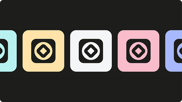 Mota — Logo and identity design for the remote work platform
1. Stop deluding yourself
It’s not the designer who makes a logo memorable, it’s the marketing. The more people see a company’s emblem wherever they go, the easier it is to remember. The logo should be everywhere: on the company’s website, on its paperwork, on social media, on every single advertising platform. Put it on your merch, packaging, emails — anywhere and everywhere you can think of.
This is something designers should be aware of in order to stay grounded. “I’ll design a logo so special it will be absolutely unmissable!” is a fundamentally flawed approach.
The designer’s job is creating the RIGHT logo.
It’s not simply about designing a good, proper logo. There are a couple more things that make an identity memorable.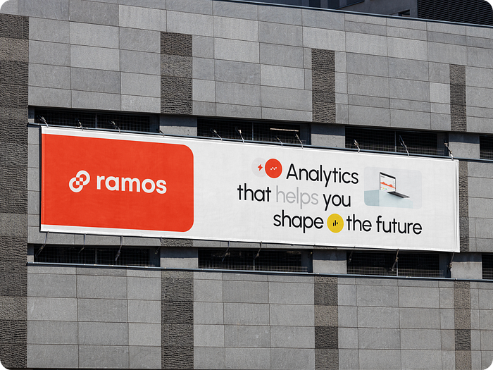 Ramos — Branding for the digital business analytic platform
2. What do consumers remember?
I don’t mean to say that a designer should slack off and forget about creativity. Not at all! All I mean is: never lose sight of the customer’s memory. This includes:
- color;
- shape;
- idea;
- accessibility;
- emotional response;
- expectations.
We are all immediately attracted by shape and color, but these things are easily forgotten.
What makes a visual object truly memorable is the idea.
The time you spend on an idea is never wasted. It’s more important than a dozen designs.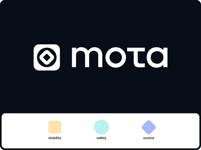 Mota — Logo and identity design for the remote work platform
3. Think right, start right
The main purpose of a logo is identifying the business or product.
Remember this before you start getting creative. A logo represents the business (or the idea behind it) and helps us recognize it. You need to create a sort of icon for a business — original yet recognizable. Elaborate abstractions may look cool but do nothing for recognizability. Obvious symbols are no good either because they’re anything but memorable.
Think more, design less.
Good design begins in your mind. To arrive at the best solution, start by collecting and analyzing all the available info on the brand, product, competitors, and target audience. Similar companies often copy one another’s designs, so it makes sense to study the logos from related business sectors.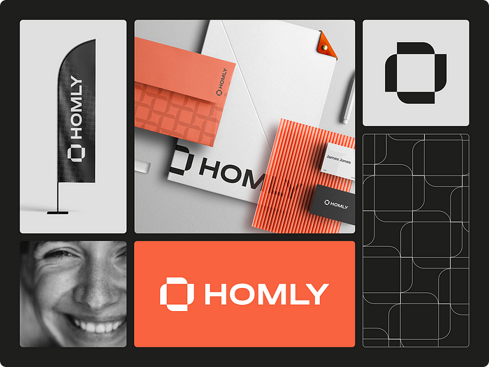 Homly — Logo and brand identity for a real estate agency
Here are some useful tips:
- Make an association map. It’s a great way to leave the beaten path and find a unique idea that your competitors haven’t already used.
- Use brainstorming.
- Show your drafts to non-designers and ask them: “What does this remind you of?” Prepare to be dismayed by their answers.
- Ask someone to look at the logo and then close their eyes. Ask them what they remember. If their recollection is too vague, consider redoing the design.
4. Offer solutions to problems
When a customer sees your logo, it should remind them of their needs: “I need to do this,” “I need this service,” “I need this product.” To serve as a reminder, your logo needs to be a concise visual representation of the brand’s essence.
An effective logo is a visible reminder of the brand’s usefulness.
This is especially important for startups and new brands unfamiliar to the audience.
To create a reminder logo, you must know your audience better than the back of your hand. Logo designers should work on developing their associative imagination skills. Tappa! — Branding for the messenger application
5. Be memorable in context
A logo doesn’t exist in a vacuum. It’s memorable as part of a visual and mental message broadcast by the brand.
A memorable logo:
- fits in with the corporate style;
- reflects the essence of the brand;
- is consistent with business goals;
- is likable.
The right logo must meet these criteria. If it does not, it won’t be all that memorable. Sure, given enough marketing efforts, it can eventually become recognizable. But it will take a lot of time, money, and energy. Those who realize they made a mistake will eventually redesign their logo. But why go to all that trouble?
The logo must be an organic part of the whole.
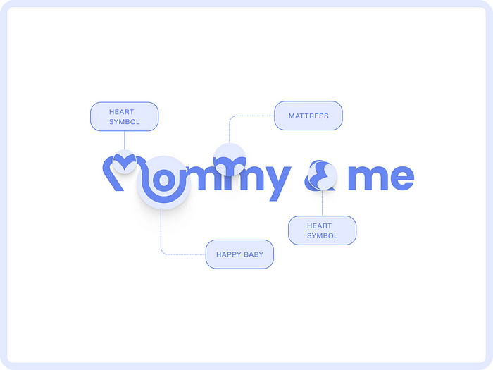 Mommy & Me — Logo and identity design for children’s brand
Study the whole as much as possible so that you can make this crucial part look natural and fun. Its job is to attract and promise new opportunities. Does it? There’s your right logo.
Visual identity in general is a separate world with its own atmosphere. As long as the brand exists, its identity is constantly being developed and updated. The logo has to remain consistent with the corporate style, even if the style changes to match the current market trends. Mommy & Me — Logo and identity design for children’s brand
6. Be legible
Simplicity and comprehensibility are essential for a memorable design. The simpler the shapes, the easier and quicker they are for the brain to read.
The association map is useful for picking the right symbol. The designer’s job is finding a simple and concise shape for this symbol.
Readability also means that the logo is easily recognizable across various platforms when it’s scaled. Omega — Logo & brand identity for the financial service company
7. Ensure quality
Quality designs means quality products. The consumer automatically associates good design with good products, even if it’s erroneous. Aesthetic design is perceived as a well-crafted product. Design is an integral part of the product, its essential attribute. The more attractive and professional the design, the more people trust the product.
8. Work in tandem
Immerse yourself into the client’s project, business, and objectives. This will make it much easier for you to find common ground, mutual understanding, and shared vision. Clients always appreciate genuine interest from designers and developers. The more in-depth your knowledge of the subject is, the more the client trusts you. You’ll have much less difficulty in justifying and explaining your decisions. Keep in touch with the client, do not hesitate to ask questions, listen rather than talk. Try to understand the client’s vision, regardless of what it means design-wise. Convo — Brand identity for the video conferencing platform
9. Test it
“Asking a friend” is good enough if you’re a freelancer or a low-budget venture. A professional logo needs serious, multiple testing both at the sketching stage and in the final version.
Logo assessment criteria:
- Is the logo unique?
- Is it prominent?
- Is it flexible in use?
- Is it memorable?
- Is it versatile?
- Is it timeless?
10. Evolve
There is such a thing as a strong logo. It has a special energy. It’s usually a brilliant idea expressed through shapes, colors, and dynamics. It’s cool and beautiful. It’s that perfect design that needs no further improvement.
For instance, the Apple logo is perfect in terms of idea and execution. It is stunning in its beautiful symbolism. The apple symbolizes knowledge. Taking a bite means partaking of a special knowledge, a special object that carries this knowledge. But if not for marketing, who would have seen this beauty? If not for the quality of the product, who would choose to buy it time and again?
Nonetheless, good design promotes itself. It’s true and it’s inspiring. :)
A strong logo is not the product of serendipity or divine revelation. It’s a result of painstaking work that involves analyzing and studying markets, competitors, the business and its goals, the tastes and desires of the audience, and the current trends. All this combined knowledge helps you create a beautiful and effective symbol. Hiddencode — Logo and brand identity for the conference event


![[ℕ𝕖𝕧𝕖𝕣] 𝕊𝕖𝕝𝕝 𝕐𝕠𝕦𝕣 𝔹𝕚𝕥𝕔𝕠𝕚𝕟 - Is Trump Dying? Or Only Killing The Market?](https://cdn.bulbapp.io/frontend/images/a129e75e-4fa1-46cc-80b6-04e638877e46/1)


