15 inspirational motion graphics and animation portfolios

At its best, animation is all about storytelling. Animation portfolios are of no exception, only that the story in this case is told by means of website design. And while you needn’t concern yourself with a narrative arc or the hero’s journey, a good animation and motion graphics portfolio should grip site visitors with a clear and compelling idea, telling the tale of your art and expertise.
To do so, include more than just the final pieces in your portfolio. Show off your storyboards, character designs, style frames, illustrations and more, to help put your work in context. Be sure to also feature your demo reel, so that potential clients can discover your range of skills all at once.
You can use a fully customizable portfolio website template to streamline the process of learning how to make a website, or design from scratch using a blank page and these web design portfolio examples for ideas. You may also find it helpful to browse through these top portfolio templates for inspiration.
To help you get started on your portfolio website, we’ve gathered 15 noteworthy animation and motion art and design graphics portfolio examples, created with Wix. Here they are, for your inspiration:
15 animation portfolios
- Hannah Jacobs
- Yukai Du
- Rafael Varona
- Yan Dan Wong
- Oono Taro
- Inbal Ochyon
- Esteban Diacono
- Daniel Aristizábal
- MegaComputeur
- Marco Mori
- Cheng-Hsu Chung
- Jon Frickey
- Jasper Van Gestel
- Anat Efrati
- Sigrun Hreins
01. Hannah Jacobs
British animator and illustrator Hannah Jacobs’ digital frame-by-frame animations are filled with soft textures, mesmerizing color palettes and seamless transitions. She’s worked with notable clients such as The New York Times, Penguin Books and TED-Ed.
Hannah’s animation portfolio features a clean grid layout, with each thumbnail leading to an inner project page. The project pages include the animation itself, accompanied by still frames and a few lines of portfolio copy to contextualize the work and give credit to anyone involved, from the art directors to the producers. 
02. Yukai Du
Award-winning illustrator and animator Yukai Du’s work is full of vibrant, liquid movements, absorbing us in the swirling and whirling of colorful shapes. Originally from China, Yukai is currently based in the UK and her impressive client list includes brands such as Adobe, Apple and The Guardian.
Yukai’s portfolio website welcomes visitors with a large animation loop, setting the stage for her unique style. Alongside each of her animations is a short written description and stills or gifs. She allows us a glimpse into her work process by including storyboards, sketches, and early style frames of her work.
03. Rafael Varona
Rafael Varona is an illustrator, animator and art director who’s worked with Google and Snapchat, amongst others. Rafael’s professional portfolio launches into a softly colored animation loop that takes up the majority of the screen, on top of which he’s placed, in large letters, his name and expertise - a major homepage design trend.
Rafael’s name is repeated on the website’s header, conveniently leading us back to the homepage once clicked. Linking your logo to the homepage is an important website navigation practice, that’s easy to implement and has great value for your portfolio’s user experience.
04. Yan Dan Wong
Yan Dan Wong’s website starts off with an animated splash page that shows off her character animation skills early on. This Malaysian freelance designer’s website is brightly colored, full of pink clouds and daisies (notice the website’s cheery little favicon), setting a mood that’s almost contrary to her sensitive and poignant subject matter.
On each of her project pages are added goodies to compliment her animated shorts, such as a brief textual background, credits and links to any press coverage, plus a few gifs and behind-the-scenes materials. By providing more in-depth content for each project, Yan paints a fuller picture of her practice and skills, and is able to grab the attention of even those site visitors who don’t immediately press ‘Play.’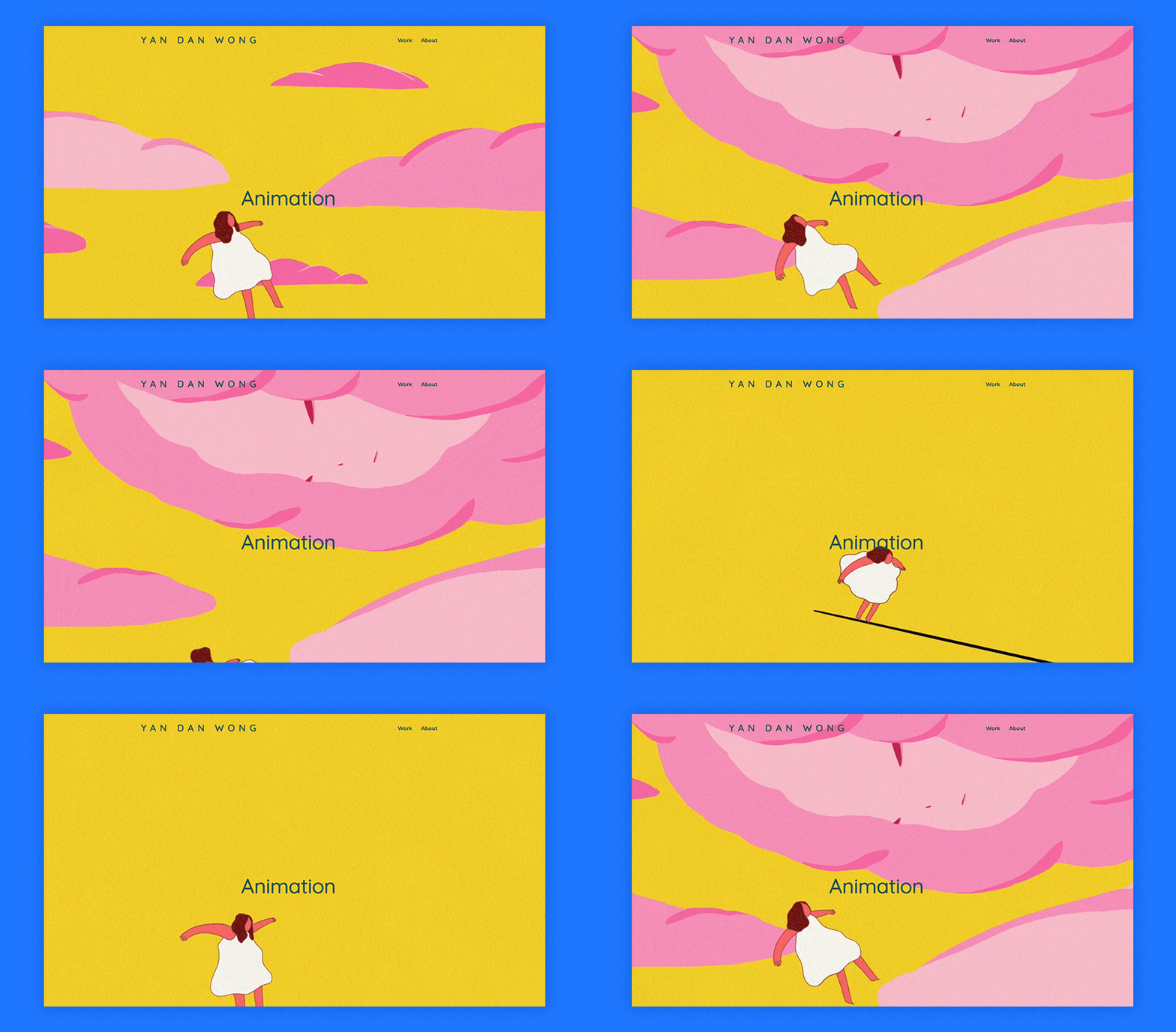
05. Oono Taro
Operating from Tokyo, Oono Taro is an illustrator, character designer, and gif animator. The animation on the homepage design is balanced out with inanimate color strips, illustrations, and patterns. This enables the motion to truly stand out, without being overshadowed by too many items competing for viewers’ attention.
At the homepage’s footer is an animated loop of two of the characters that appear at the top of the page. These two running, grinning characters help tie the page together.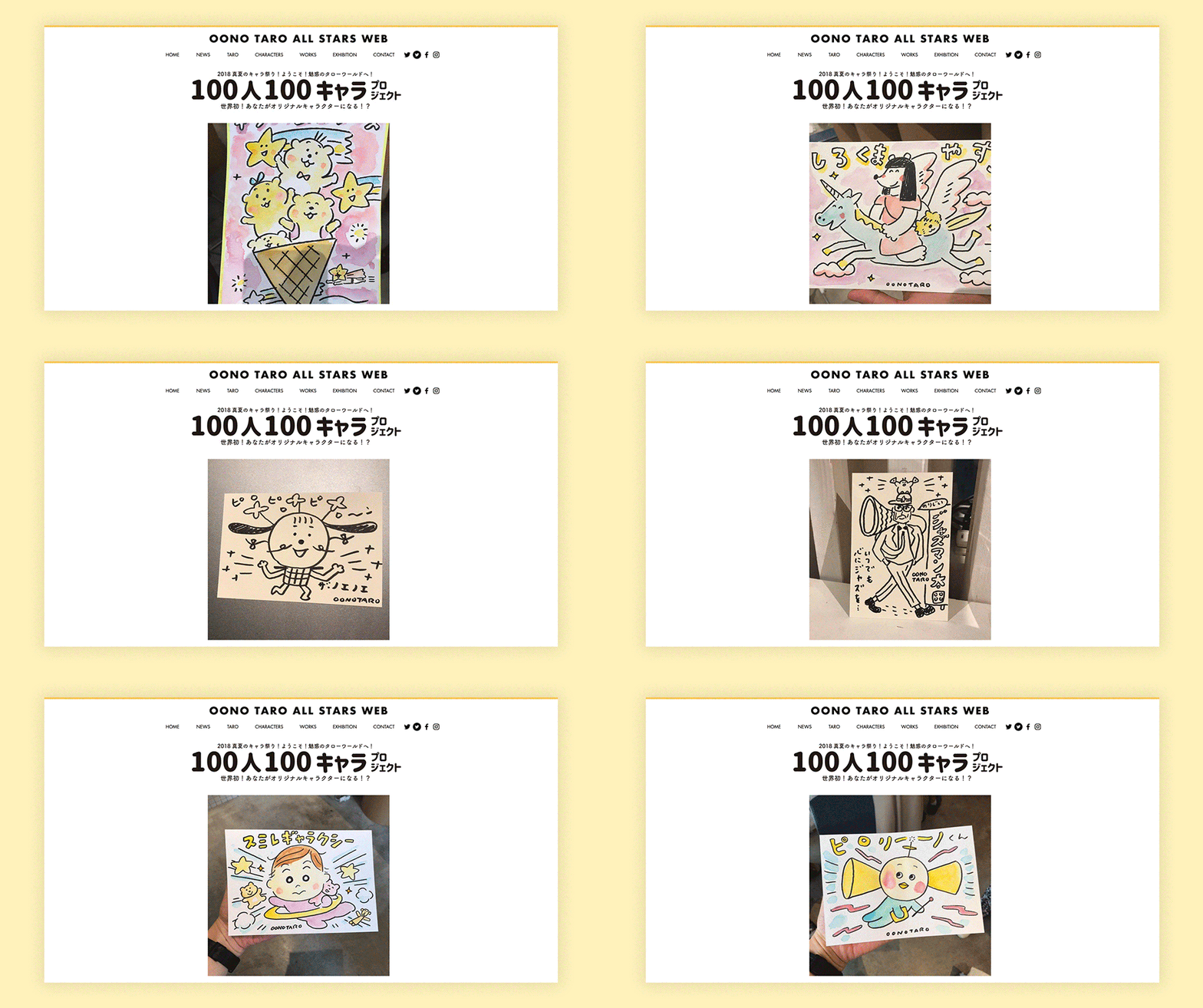
06. Inbal Ochyon
Inbal Ochyon’s animation portfolio greets visitors with a simple, to-the-point message: her name and expertise are written in large type, accompanied by a flying stork for added motion. Below we find Inbal’s showreel, followed by her works in a grid format using the Wix Pro Gallery.
Her project pages display an array of gifs and stills with subtle parallax scrolling effects, creating a diversified browsing experience. The navigation menu is minimal, composed of only a ‘Work’ page and an ‘About’ page, which is a recommended practice for designing an art portfolio, or similar type of website, that’s easy to maintain.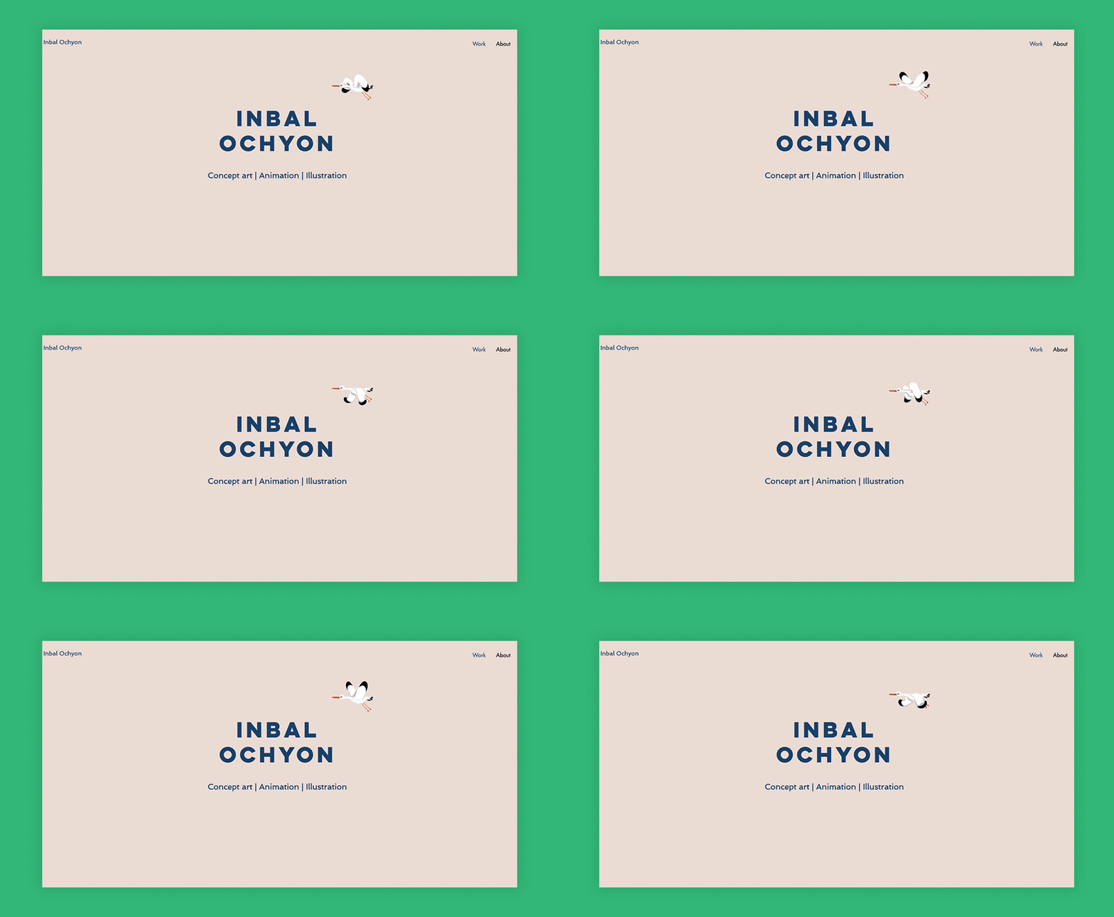
07. Esteban Diácono
Argentinian motion graphics designer Esteban Diácono has worked with companies such as Apple and Gucci. The top fold of his website features a large, fast-paced reel of his works, leaving no room for confusion as to his line of work. Also on the top fold are a logo made up of Esteban’s initials, together with his full name and speciality - a great tip for boosting your portfolio’s Google ranking.
Esteban links to his different social media accounts in his ‘Contact’ page, alongside a gif of dancing characters. Additionally, his Instagram Feed is set up directly on his site (under the appropriately titled page, ‘Lab’), so that his portfolio is always up-to-date with his latest work and experiments.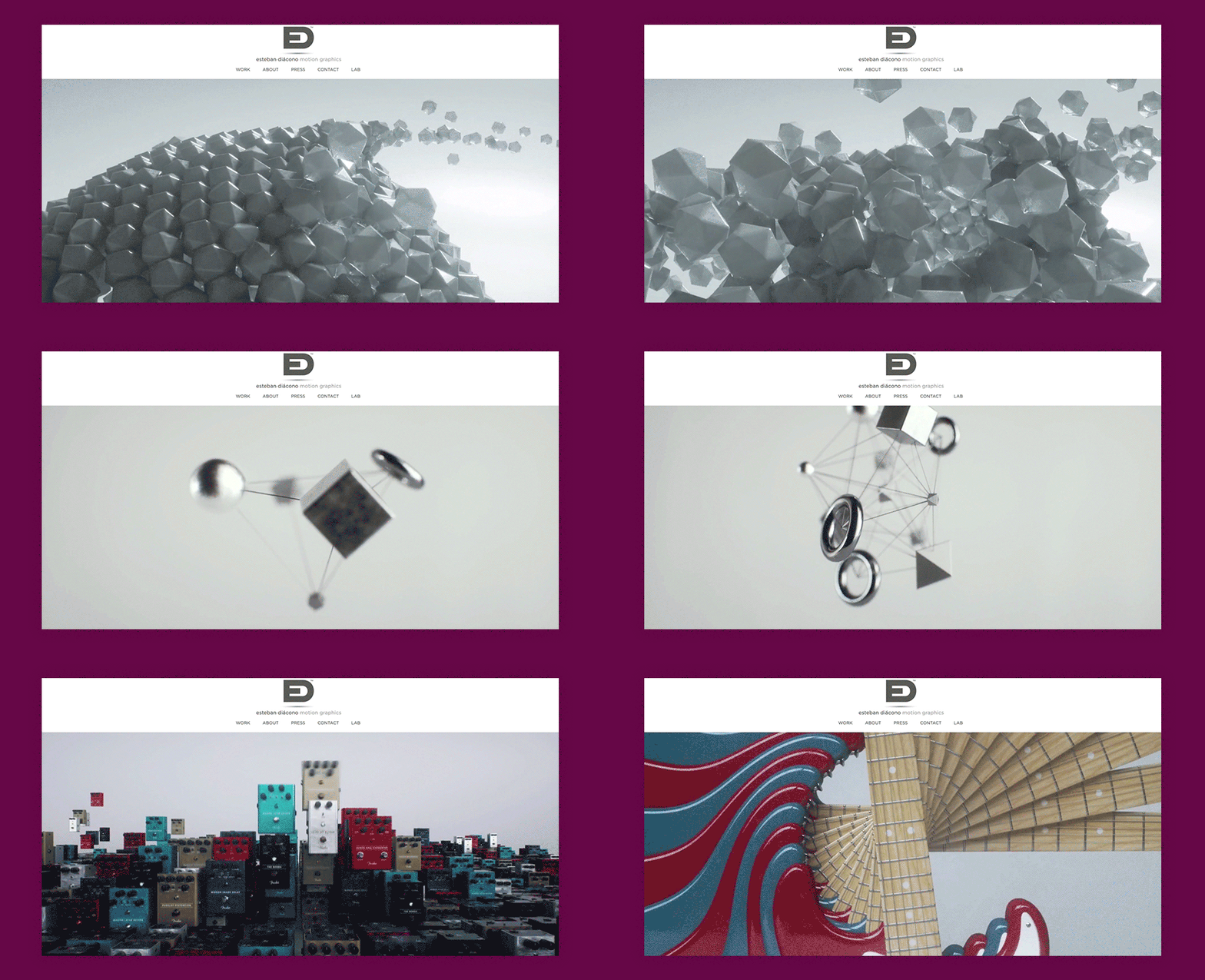
08. Daniel Aristizábal
Colombian animator and motion graphics designer Daniel Aristizábal’s portfolio immediately stands out with its pitch black background. Equally unique is the site’s navigation, starting with its website menu. The menu here is split up into four icons and buttons that are spread across all corners of the screen.
The navigation between the different projects is also intriguing. With no gallery or ‘Work’ page, the homepage is one long scroll in which more and more projects seem to materialize into view as we explore further. 
09. MegaComputeur
MegaComputeur is a French animation collective, whose members are Corentin Yvergniaux, Oscar Malet, and Camille Jalabert. The three friends collaborate in making computer animated shorts (hence the name). Their strong emphasis on character animation shines through in their filmmaking, as well as their website design, with character sheets and other materials from their work process.
The homepage is designed with full-width strips, each featuring a still image from a different animated short by the collective. When hovering over any of the strips, the film’s name shows up, resulting in an intuitive navigation system that places the movie’s beautiful artwork front and center.
10. Marco Mori
German animator and motion graphics designer Marco Mori is known for his outlandish and grotesque personal style. A fullscreen video on the website’s top fold lets us into his intriguing world, where bizarre 3D characters can be seen dancing, deflating, and popping in ways that no human body ever could.
His website’s About page shares some information about the man behind the work, with short text and a photo that puts a face to the name. Also on the page is a list of Marco’s press appearances, so that site visitors can easily read on to find out more.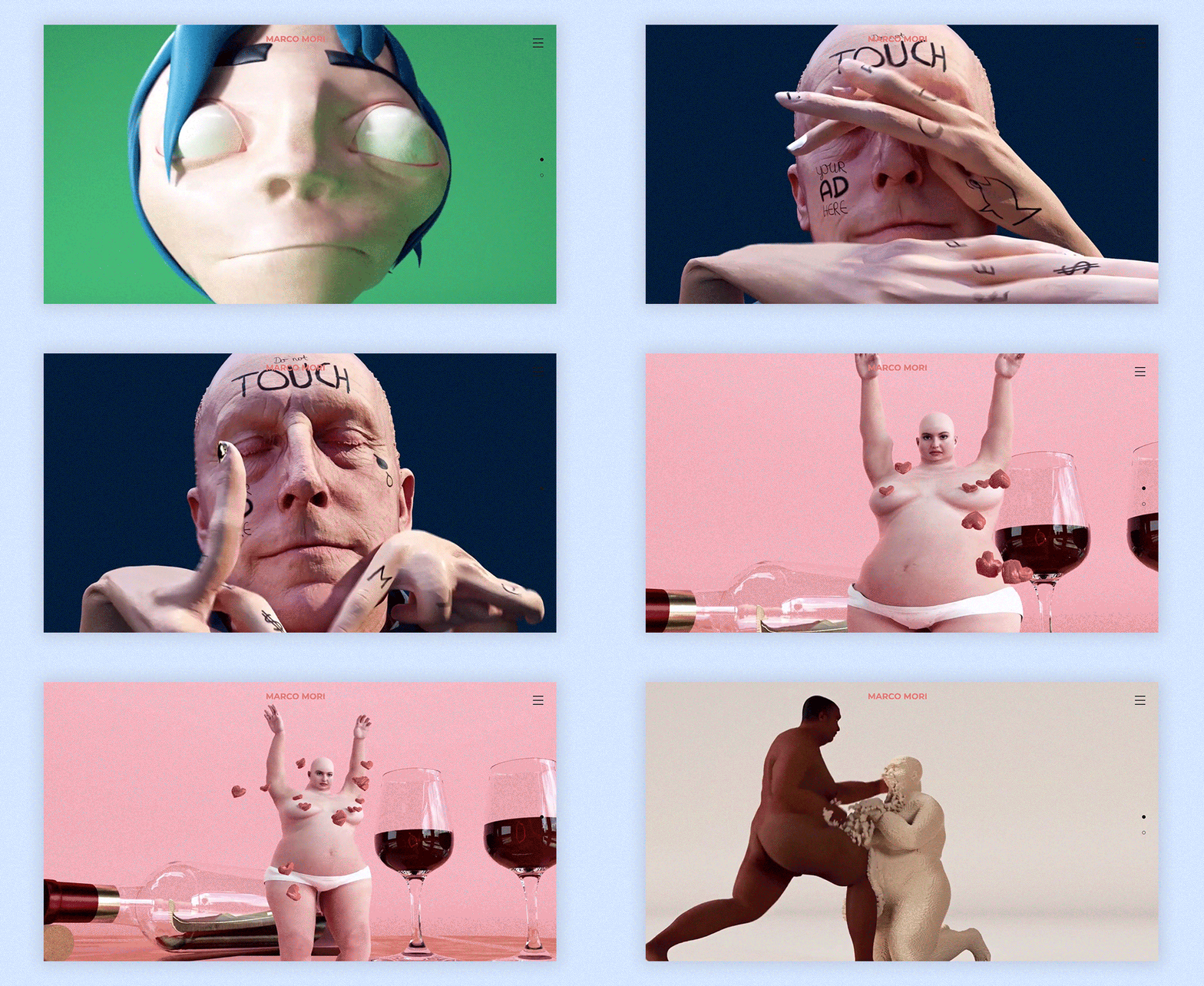
11. Cheng-Hsu Chung
Originally from Taiwan and currently based in Berlin, animator and director Cheng-Hsu Chung has worked with clients like Adidas and the BBC. His animations are at times created digitally and at others times made by hand. But no matter the technique, his work is characterized by a colorful and wild cartoonish look.
While making his portfolio, Cheng-Hsu’s website design is simple and its layout minimalistic. Providing a touch of his personal sense of style is his animated logo, composed of shape-shifting typography that ties in with his animation works.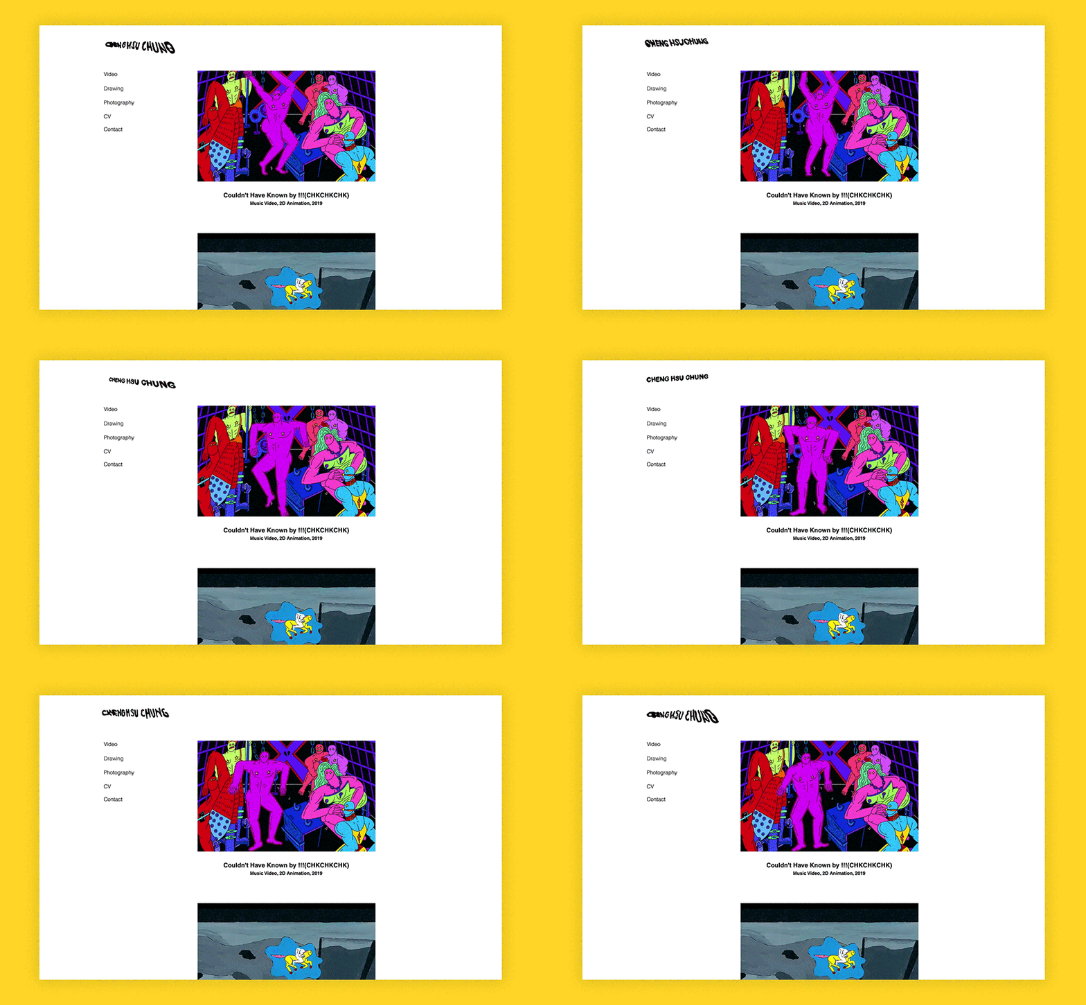
12. Jon Frickey
Hamburg-based animator and illustrator Jon Frickey’s personal style is diverse, expertly boasting both a vector illustration and a brush-painted look. His online portfolio merges the different styles into one happy selection of visuals, combining loops, still frames and illustrations.
Jon’s award-winning animated short, Cat Days, also has a designated movie website of its own. This one-pager features the film’s trailer, and lists anything from its many reputable awards, to its synopsis and credits. It also includes downloadable files ready for press use, including the movie poster and its press kit.
13. Jasper Van Gestel
Belgian animator and illustrator Jasper Van Gestel’s portfolio website is sure to bring up a smile. At the very top of the design portfolio is a gif of an enthusiastic little doggy, wiggling its tail while hitting its laptop keyboard to the sight of a bone flashing on screen.
The rest of the page is filled with a grid layout of Jasper’s works, with gifs carefully scattered around the page, ensuring not to lose visitors’ focus by having too much motion in one go. Despite the clean layout, Jasper has made sure to include a brief description of each project, that appears when hovering over the image.
14. Anat Efrati
Tel Aviv-based animator Anat Eftrati’s signature style treads a fine line between the depth of stop motion and the flat 2D feel. Her animation portfolio features a large, endearing portrait of the artist at the top, which also doubles as her logo and leads back to the homepage. And to make navigation all the easier, Anat’s added a Back to Top button that only appears once visitors scroll down the page.
For displaying her different projects, Anat made sure to create a diverse gallery that includes still frames and loop animations. She also clearly labeled her projects with the awards they’ve won. 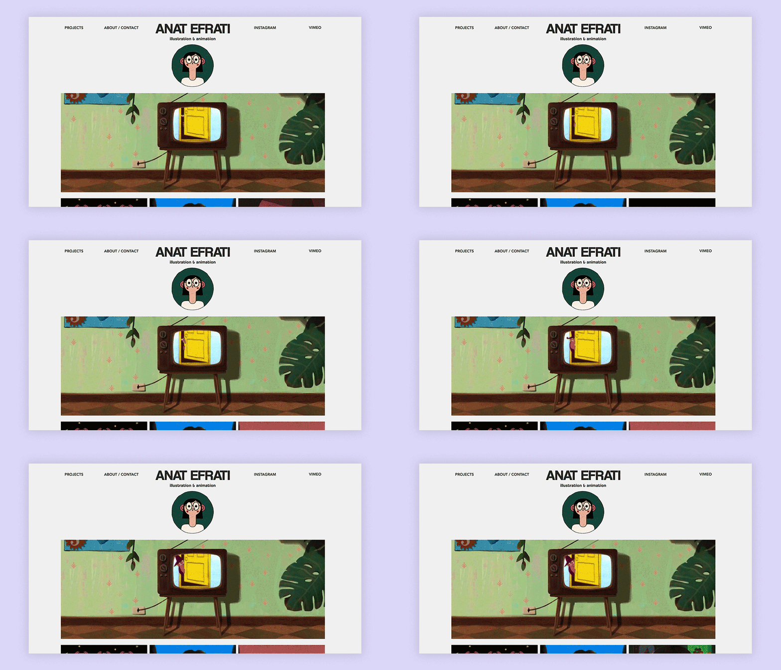
15. Sigrún Hreins
Icelandic animator Sigrún Hreins’ many different projects are all compiled under a bright pink header and footer, two vivid elements that tie the site together. Both the header and footer include Sigrún’s different social media links for easy access.
Her ‘Info & Contact’ page gives site visitors some background into her professional skills, motivations and even hobbies. Together with an animated self-portrait, we can begin to get a sense of who Sigrún is as a person, adding a sense of credibility and reliability to her personal brand.
Why you should make an animation portfolio website
There are many compelling reasons why you should create an animation portfolio website. Here are some of the most significant benefits:
1. Showcase your talent: A dedicated website allows you to present your work in a professional and organized manner. You can showcase your best animation projects, including reels, demo videos and individual shots. This provides potential employers and clients with a clear understanding of your skills and experience. 2. Reach a wider audience: Your website can be accessed by anyone with an internet connection, expanding your reach beyond local opportunities. This opens doors to potential collaborations and projects from around the world. 3. Build your brand: Your website serves as a platform to establish your personal brand as an animator. You can control the narrative and presentation of your work, creating a unique and memorable online presence. 4. Increase credibility: Having a professional website demonstrates your commitment to your craft and professionalism. It portrays you as a serious and organized individual, which can be a valuable asset in a competitive industry. 5. Generate leads and clients: Your website can act as a lead generation tool. By including contact information and a clear call to action, you can attract potential employers and clients who are interested in your work. 6. Network and collaborate: Your website can be a hub for connecting with other animators, industry professionals and potential collaborators. Joining online communities and forums can further enhance your networking opportunities. 7. Stay up-to-date: Your website allows you to display your latest projects and keep your portfolio updated. This ensures that potential clients always see your freshest work and understand your current skillset. 8. Gain feedback: Your website provides a platform for receiving feedback and recognition on your work. This can be helpful for improving your skills and identifying areas for development. 9. Promote your services: You can use your website to promote your services as an animator. This is especially helpful if you freelance or offer animation services on a project basis. 10. Track your progress: Your website can be a valuable tool for tracking your progress as an animator. By analyzing website traffic and visitor engagement, you can gain insights into what resonates with your audience and identify areas for improvement.
Types of animation portfolios
- Website portfolio: Showcases diverse work with flexibility and customization.
- Online portfolio platforms: Easy setup with pre-built templates and social media integration.
- Video showreel: Concise and impactful way to showcase best work visually.
- Print portfolio: Tangible and professional presentation for in-person meetings.
- Interactive portfolio: Unique and engaging experience with animation and interactivity.
What should an animation portfolio have in it?
An animation portfolio should showcase a diverse range of work that highlights your skills, creativity and versatility as an animator. Here are some key elements that an animation portfolio should include:
- Showreel or demo reel: Start your portfolio with a showreel or demo reel that provides a brief overview of your best animation work. This should be a compilation of short clips showcasing your animation skills, including character animation, motion graphics, visual effects and any other relevant styles or techniques.
- Individual projects: Feature individual animation projects that demonstrate your ability to tell stories, create characters and convey emotions through animation. Include a variety of styles and themes to showcase your versatility as an animator. Each project should include a description or breakdown of your role in the animation process, including concept development, storyboarding, animation and post-production.
- Character animation: Highlight your proficiency in character animation by including examples of animated characters with a range of expressions, movements and interactions. Showcasing your ability to bring characters to life through animation is essential for many animation roles, whether in film, television, gaming or advertising.
- Motion graphics: If you specialize in motion graphics or visual effects, include examples of your work in this area. Showreels or individual projects demonstrating your skills in creating dynamic typography, motion design, transitions and special effects can be particularly impactful.
- Technical skills: Showcase your technical skills by including examples of 3D animation, rigging, lighting, rendering and compositing if applicable. Providing insight into your technical proficiency can be valuable for potential employers or clients looking for specific skills or expertise.


![[LIVE] Engage2Earn: McEwen boost for Rob Mitchell](https://cdn.bulbapp.io/frontend/images/c798d46f-d3b8-4a66-bf48-7e1ef50b4338/1)


![[ℕ𝕖𝕧𝕖𝕣] 𝕊𝕖𝕝𝕝 𝕐𝕠𝕦𝕣 𝔹𝕚𝕥𝕔𝕠𝕚𝕟 - And Now What.... Pray To The God Of Hopium?](https://cdn.bulbapp.io/frontend/images/79e7827b-c644-4853-b048-a9601a8a8da7/1)


